

Build a Bicycle tap Game in React Native Part 3: Assets
Previous: Build a Bicycle tap Game in React Native Part 2: Initial Setup
This section explains how the game’s visual assets are loaded, and rendered to achieve smooth performance and consistent visuals across devices. It covers the use of Lottie animations for characters and gameplay feedback, SVG components for scalable and resolution-independent UI elements, and tiled background images for infinite scrolling environments. The focus is on keeping assets lightweight, predictable, and easy to maintain while ensuring they integrate cleanly with Reanimated and the game loop.
This project relies on two main asset types for visuals:
- Lottie animations for the character and the monster
- SVG components for the background and the flag
Assets are loaded declaratively and remain largely presentation-focused, with small, explicit hooks (like onLoop) used to coordinate gameplay behavior.
Asset sources
You can download and use the same assets used in this project from here.
Alternatively, you are free to use your own .lottie and SVG assets, as long as:
- .lottie files are supported by your Metro configuration
- SVGs are implemented as React components (via react-native-svg)
No changes to the core asset-loading logic are required when swapping assets.
Lottie Animations
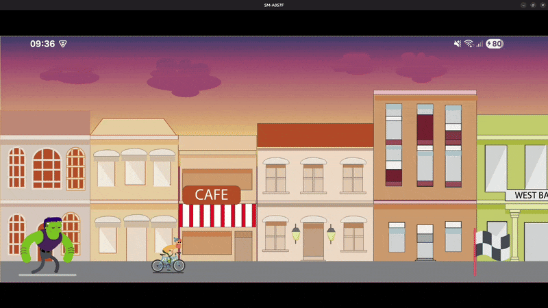
Lottie animations are used to render the two main animated entities in the scene:
- The monster
- The character
Both are represented as .lottie files and rendered directly using the DotLottie component. This approach provides smooth, vector-based animations while keeping asset sizes small and easy to manage.
Rendering the monster and the character
Each entity is positioned independently using absolute positioning and a shared ground level. No game logic or animation logic is embedded here this layer is purely visual.
1import { DotLottie } from "@lottiefiles/dotlottie-react-native";
2import { View } from "react-native";
3
4const GROUND_LEVEL = 10;
5const MONSTER_SIZE = 100;
6const MONSTER_INITIAL_POSITION = 25;
7const CHARACTER_SIZE = 75;
8const CHARACTER_INITIAL_POSITION = 225;
9
10export default function App() {
11  return (
12    <View style={{ backgroundColor: "white", flex: 1 }}>
13      {/* Monster */}
14      <View
15        style={{
16          position: "absolute",
17          bottom: GROUND_LEVEL,
18          left: MONSTER_INITIAL_POSITION,
19        }}
20      >
21        <DotLottie
22          source={require("./assets/monster.lottie")}
23          style={{ width: MONSTER_SIZE, height: MONSTER_SIZE }}
24          loop
25          autoplay
26        />
27      </View>
28
29      {/* Character */}
30      <View
31        style={{
32          position: "absolute",
33          bottom: GROUND_LEVEL,
34          left: CHARACTER_INITIAL_POSITION,
35        }}
36      >
37        <DotLottie
38          source={require("./assets/character.lottie")}
39          style={{ width: CHARACTER_SIZE, height: CHARACTER_SIZE }}
40          loop
41          autoplay
42        />
43      </View>
44    </View>
45  );
46}
Asset loading behavior
- Both animations are bundled as static .lottie assets
- The source prop references the local animation file
- No sprite sheets or frame-by-frame logic is required
Playback configuration
For both the monster and the character:
- autoplay starts the animation as soon as the component mounts
- loop ensures continuous animation (idle or running state)
This setup is ideal for entities that should remain animated by default.
Why Lottie works well for characters
- Smooth, resolution-independent animations
- Small file size compared to image sequences
- Simple API for rendering and playback
- Easy asset replacement without touching layout code
At this stage, the monster and character are purely visual entities. Their movement, interactions, and state transitions are handled elsewhere, keeping asset rendering clean and focused.
SVG components
In addition to .lottie animations, the project uses SVG-based React components for visual elements that must remain crisp and scalable on every screen size. In this scene, SVG components are used for:
- Background (vector-based background rendering)
- Flag (finish marker / goal indicator)
SVG assets are ideal here because they are resolution-independent, lightweight, and behave like normal React components (you can pass props such as width and height).
Background
Start with a fixed aspect ratio
The background is an SVG with a known design ratio. We keep it consistent on every device using a constant.
1const BACKGROUND_ASPECT_RATIO = 665 / 241;This ensures the background never looks stretched or squashed.
Note: The BACKGROUND_ASPECT_RATIO value is based on the original background asset used in this project. If you use a different background image or SVG, make sure to update this ratio to match your asset’s original dimensions to avoid distortion.
Read the device height
We use the current screen size to scale the background:
1import { Dimensions } from "react-native";
2
3const { height } = Dimensions.get("window");
Here we only use height because the game is landscape and we want the background to always fill the vertical space.
Compute background dimensions from the screen height
We force the background to match the screen height, then compute the width using the aspect ratio:
1const backgroundHeight = height;
2const backgroundWidth = height * BACKGROUND_ASPECT_RATIO;
So the background:
- always fills the screen vertically
- scales proportionally across devices
Render the background first
Finally, render the Background component at the top of the tree (first child of the parent View):
1<Background width={backgroundWidth} height={backgroundHeight} />Because it’s rendered first and not absolutely positioned, it naturally becomes the back layer of the scene, with the monster, character, and flag appearing on top.
Flag
Define flag-related constants
The flag is a fixed visual landmark, so its size and position are defined explicitly using constants:
1const FLAG_SIZE = 75;
2const FLAG_OFFSET = 50;- FLAG_SIZE controls the rendered size of the SVG
- FLAG_OFFSET defines how far the flag sits from the right edge of the screen
Using constants makes it easy to tweak the layout without touching rendering logic.
Place the flag using absolute positioning
Place the flag element before the character lottie and after the backgroud:
1<View
2  style={{
3    position: "absolute",
4    bottom: GROUND_LEVEL,
5    right: FLAG_OFFSET,
6  }}
7>
8  <Flag width={FLAG_SIZE} height={FLAG_SIZE} />
9</View>
This is important so the background does not hide the flag and character appears above the flag on collision.
With all visual assets in place Lottie animations for animated entities and SVG components for structural elements the scene is now fully composed. The next step is to bring it to life by introducing game logic: defining movement, updating positions over time, handling interactions, and managing game state. In the following section, we’ll shift focus from what is rendered to how the assets move.
Next: Build a Bicycle tap Game in React Native Part 4: Game Movement